Thanks to Middlebury Physics Professor Richard Wolfson for first suggesting this idea several years ago, and for sending me a set of temperature data to get started.
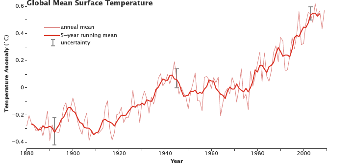
This short demo translates a list of average global temperatures from 1880-2014 into a short musical passage.
The graph, from NASA, shows the data visually.
The musical sounds are triggered by each year's temperature. Lower temperatures create low-pitched sounds. Higher temperatures produce high-pitched sounds. In other words, the temperature data is simply scaled linearly to the notes of the piano keyboard.
But instead of a piano, I used some synthesizer sounds that seemed to capture the idea in a musically interesting way.
I'm very interested in this idea of translating various kinds of data into sound. Currently I'm working on projects that make use of wind, wave and current data from ocean buoys, and have also been working with the wind data gathered at Diamond Island in Lake Champlain.
